In the beginning…
So, I have to admit, I didn’t start this project when I should have. I wasn’t struck by inspiration when I was first given this project, so it took me a while to get moving. I found a few ideas on Hongkiat and decided that I really liked the look of the calendars where you could see all 12 months up in a grid. I also knew that I wanted something very visual, with good photography. But what should I use for my subject matter?
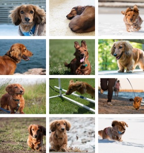
I initially thought I’d design a calendar featuring my horrible-adorable dog, Nibbler (named after this cutie from Futurama). My husband and I had been planning on making a printed calendar of him for years but we didn’t know if we had enough seasonally relevant images to fill 12 months. I set to work making a basic mockup of how those images would look together, and the result is below. Not bad, but I wasn’t sure there would be enough room for the actual calendar part. And it’s still a bit of a stretch on some of images, making them seem seasonally appropriate.
Plus, since this is supposed to have potential as a portfolio piece, it would probably be a good idea to use my own photography. I have accumulated quite a lot of images over the 15-months that I’ve had a camera in my hand. Unfortunately, I didn’t have 12 images I liked that were:
- Of any single subject matter or theme
- All of the same orientation
- Had enough space for the calendar part
So, after combing through all of my images, I went a little more abstract. I chose 12 of my favourite images that satisfied 2) and 3) above, then tried to figure out how to organize them into something that made any sense at all. Here’s the result.

I ended up trying to organize by colour and feeling first, then subject matter. The first 3 images are for colder months, so I thought dark, rich colours would work well. Plus I could kind of build it around a soup theme (the need to warmed up). The next 3 images are for the months from spring to summer, so I started with colours that transition from pale to bright, and with people as the unifying theme. For the next 3 images, I picked images with colours that go from bright to earthy, with a nature theme (sharp-eyed individuals will spot Nibbler for the month of September, his birthday month). And finally, the last 3 images move from earthy tones back to dark rich colour, with an urban feel.
The execution
I wasn’t really sure how difficult it would be to code out what I wanted; I hoped to create the thumbnail grid (as shown in my wireframe) as a navigational element (using anchors) that would take the user to a larger view of the individual month they had selected. Since the minimum requirement was to have one month completed, I worked on the individual months first, which actually went quite smoothly. My biggest hurdles here were image export (I had to redo it a few times due to poor planning) and also the positioning of the calendar info. I had created 3 classes for vertical positioning of the calendar info; these surprisingly worked out really well. I just needed to tweak that position for a few of the months, either a little to the left or right. This proved extremely challenging on the month of May. The solutions I had used on other months did not work here; after a few hours of fiddling, I ended making it work by using a negative margin on the left side.
Navigation grid for the win
At the eleventh hour, I finally decided that I really did want this navigational thumbnail grid; after all, that’s what inspired me to begin with and I would feel like the project was incomplete without it. While my unordered list transformed relatively quickly, all those little finesse things I wanted proved a bit more challenging. I was lucky to have my husband stay up to help me figure it out, but it was reassuring to know that I wasn’t far off the mark. All in all, I’m pretty pleased with my calendar. I had also wanted it to toggle with show/hide on the months using only CSS, but had to let it go. For now…

Amazing work! I particularly appreciate how detailed your explanation of the process you took was. This calendar looks like it could be printed as well. I really like the photos you chose and took yourself, it really came together well at the end.
LikeLike